Transforms

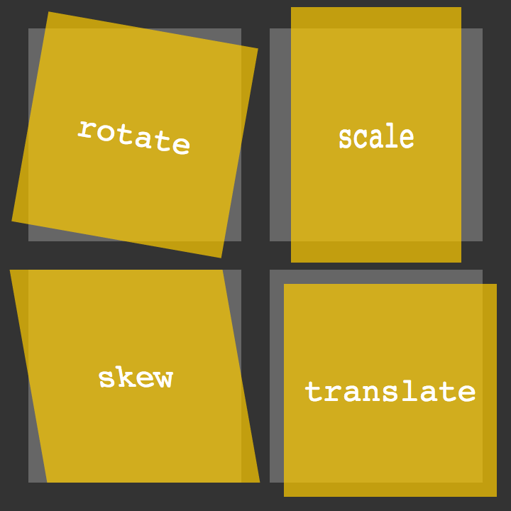
- The transform property comes in two different settings, two-dimensional and three-dimensional. Each of these come with their own individual properties and values.
Transform Syntax
- The actual syntax for the transform property is quite simple, including the transform property followed by the value. The value specifies the transform type followed by a specific amount inside parentheses.
2D Transforms
- Two-dimensional transforms work on the x and y axes, known as horizontal and vertical axes. }
2D Rotate :
- he rotate value provides the ability to rotate an element from 0 to 360 degrees. Using a positive value will rotate an element clockwise, and using a negative value will rotate the element counterclockwise.
.box-1 { transform: rotate(20deg);
2D Scale :
- Using the scale value within the transform property allows you to change the appeared size of an element.
.box-1 { transform: scale(.75);}
2D Translate :
- The translate value works a bit like that of relative positioning, pushing and pulling an element in different directions without interrupting the normal flow of the document.
.box-1 { transform: translateX(-10px);
2D Skew :
- skew, is used to distort elements on the horizontal axis, vertical axis, or both.
.box-1 { transform: skewX(5deg);}
3D Transforms
- hree-dimensional transforms work on both the x and y axes, as well as the z axis.
3D Rotate :
.box-1 { transform: perspective(200px) rotateX(45deg);}3D Scale
.box-1 { transform: perspective(200px) scaleZ(1.75) rotateX(45deg);}3D Translate :
.box-1 { transform: perspective(200px) translateZ(-50px);}
Transitions & Animations
Transitions
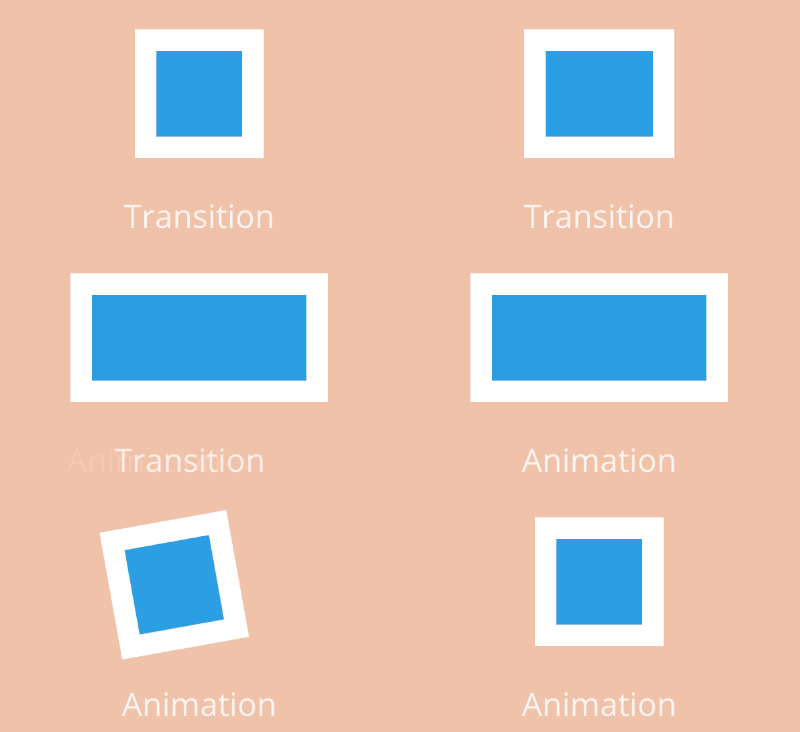
- A transition is an element must have a change in state, and different styles must be identified for each state.
-
The easiest way for determining styles for different states is by using the
:hover,:focus,:active, and:targetpseudo-classes. - There are four transition related properties in total, including
transition-property,transition-duration,transition-timing-function, andtransition-delay.Transition proparty :
Animations

- Transitions do a great job of building out visual interactions from one state to another, and are perfect for these kinds of single state changes. However, when more control is required, transitions need to have multiple states. In return, this is where animations pick up where transitions leave off.
Animations Keyframes
- To set multiple points at which an element should undergo a transition, use the
@keyframesrule. The@keyframesrule includes the animation name, any animation breakpoints, and the properties intended to be animated.
Fade in
- Having things fade in is a fairly common request from clients. It’s a great way to emphasize functionality or draw attention to a call to action.
- Fade in effects are coded in two steps: first, you set the initial state; next, you set the change.
Change color
- Animating a change of color used to be unbelievably complex, with all kinds of math involved in calculating separate RGB values and then recombining them.
Grow & Shrink
- To grow an element, you used to have to use its width and height, or its padding. But now we can use CSS3’s transform to enlarge.
- Shrinking an element is as simple as growing it. To enlarge an element we specify a value greater than 1, to shrink it, we specify a value less than 1.
Rotate elements
- CSS transforms have a number of different uses, and one of the best is transforming the rotation of an element.
Square to circle
- A really popular effect at the moment is transitioning a square element into a round one, and vice versa. With CSS, it’s a simple effect to achieve, we just transition the border-radius property.
3D shadow
- This effect is achieved by adding a box shadow, and then moving the element on the x axis using the transform and translate properties so that it appears to grow out of the screen.
Swing
you cav create it using @keyframes, animation and animation-iteration.
Inset border
- One of the hottest button styles right now is the ghost button; a button with no background and a heavy border.

What Google Learned From Its Quest to Build the Perfect Team :
The key characteristics of ‘enhanced teams’
-
After years of analyzing data and interviews from more than 180 teams across the company, Google found that the kinds of people (a.k.a. the individual personalities) in a team are not so relevant.
-
“We had lots of data, but there was nothing showing that a mix of specific personality types or skills or backgrounds made any difference. The ‘who’ part of the equation didn’t seem to matter,” Dubey said in an interview with The New York Times.
-
the researchers found that there were five key characteristics of enhanced teams:
- Psychological safety: Everyone feels safe in taking risks around their team members, and that they won’t be embarrassed or punished for doing so.
-
Dependability: Everyone completes quality work on time. Structure and clarity: Everyone knows what their specific expectations are. These expectations must be challenging yet attainable.
-
Meaning: Everyone has a sense of purpose in their work (i.e., financial security, supporting family, helping the team succeed, etc.).
-
Impact: Everyone sees that the result of their work actually contributes to the organization’s overall goals.
- The researchers at Google describe two factors that seem to make the biggest difference in creating psychologically safe environments for collaboration:
-
relatively equivalent air time among all team members in their discussions
-
a high overall level of social sensitivity

