Responsive Web Design
- Responsive web design is the practice of building a website suitable to work on every device and every screen size, no matter how large or small, mobile or desktop.
- Responsive web design is focused around providing an intuitive and gratifying experience for everyone. Desktop computer and cell phone users alike all benefit from responsive websites.

Responsive vs. Adaptive vs. Mobile
- Responsive and adaptive web design are closely related, and often transposed as one in the same.
- Responsive generally means to react quickly and positively to any change, while adaptive means to be easily modified for a new purpose or situation, such as change.
- With responsive design websites continually and fluidly change based on different factors, such as viewport width, while adaptive websites are built to a group of preset factors.
-
A combination of the two is ideal, providing the perfect formula for functional websites. Which term is used specifically doesn’t make a huge difference.
- Mobile, on the other hand, generally means to build a separate website commonly on a new domain solely for mobile users. While this does occasionally have its place, it normally isn’t a great idea.
- Mobile websites can be extremely light but they do come with the dependencies of a new code base and browser sniffing, all of which can become an obstacle for both developers and users.

What is “Float”?
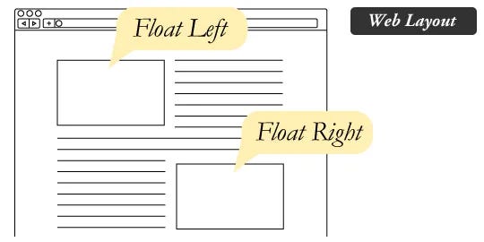
- Float is a CSS positioning property. To understand its purpose and origin, we can look to print design.
- In a print layout, images may be set into the page such that text wraps around them as needed. This is commonly and appropriately called “text wrap”. Here is an example of that.

## What are floats used for?
- Floats are also helpful for layout in smaller instances. Take for example this little area of a web page.
Clearing the Float
- An element that has the clear property set on it will not move up adjacent to the float like the float desires, but will move itself down past the float.

SMACSS
- SMACSS is a way to examine your design process and as a way to fit those rigid frameworks into a flexible thought process. It is an attempt to document a consistent approach to site development when using CSS.